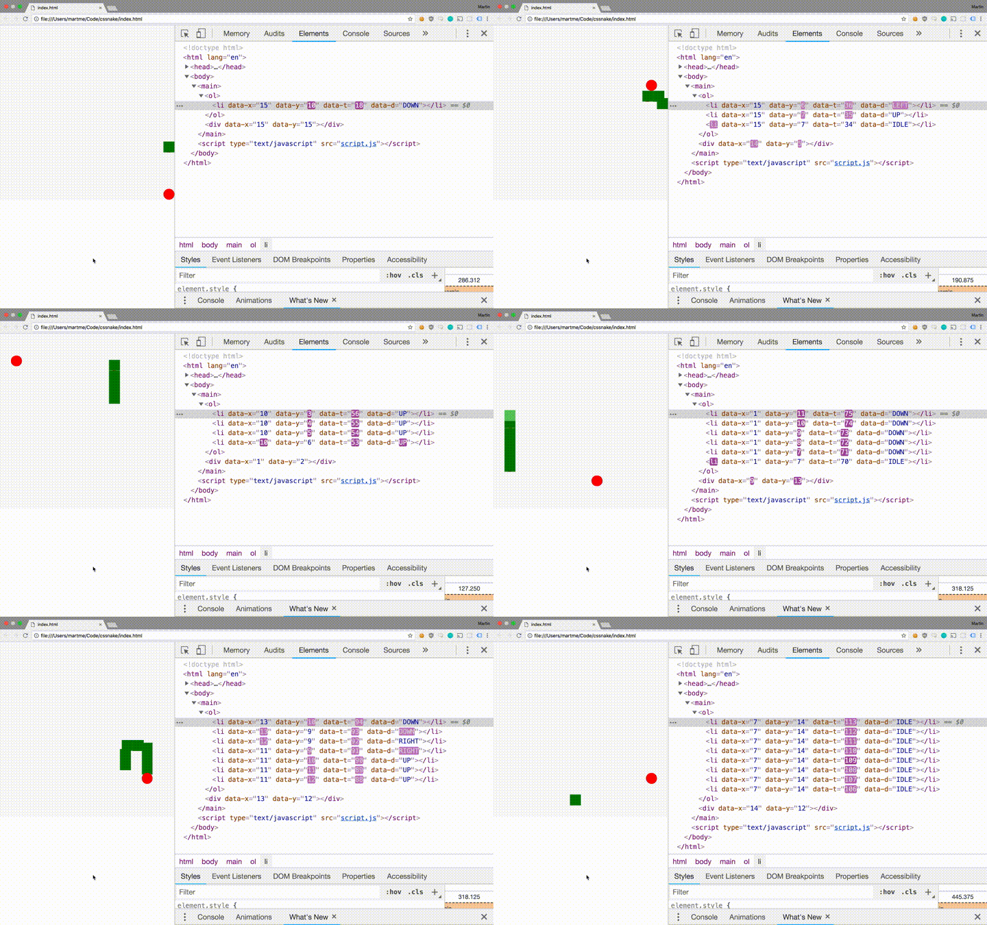
Simple implementations of a Snake game are rather forgiving - you only need to be able to draw moving squares on the screen and act upon keyboard input. CSS3 enable browser animations and HTML elements can be styled as squares. I wanted to leverage this and make a simple snake game with minimal use of JavaScript.
Source code available on github.
Why?
Because inspecting the DOM while running the game is mesmerizing!

Want to try? Go to martme.github.io/css-snake/.
Implementation
The snake is an ordered element of squares starting with a head. Additional
elements are added for each apple eaten by the head. Thus we can represented a
snake as list items <li> in an ordered list <ol>. The apple is represented
as a <div> element.
Elements are given a width and height using CSS, ensuring their square shape.
Their position in a grid is denoted by data-x and data-y attributes on the
HTML element. All elements have the CSS property position: absolute and CSS
for corresponding top and left values are generated with SCSS as follows:
@for $i from 0 to $n {
  [data-x="#{$i}"] {
    left: calc(#{$i} * 100% / #{$n});
  }
  [data-y="#{$i}"] {
    top: calc(#{$i} * 100% / #{$n});
  }
}
Here the elements' parent has position: relative and a defined width and
height. The variable $n denotes the number of rows and columns in the grid.
The size of the elements can be defined as follows:
$n: 16;
li,
div {
  width: calc(100% / #{$n});
  height: calc(100% / #{$n});
  position: absolute;
}
Movement is achieved using CSS animations. A move is completed in a single 'tick' thus ticks occur at an interval defined by the animation duration chosen in CSS. An element can move a distance equal to its size, either vertically or horizontaly, over the duration of a tick. This yields can be expressed using CSS.
@keyframes RIGHT {
  0% {
    transform: translateX(0);
  }
  100% {
    transform: translateX(calc(100vh / #{$n}));
  }
}
@keyframes LEFT {
  0% {
    transform: translateX(0);
  }
  100% {
    transform: translateX(calc(-100vh / #{$n}));
  }
}
@keyframes UP {
  0% {
    transform: translateX(0);
  }
  100% {
    transform: translateY(calc(-100vh / #{$n}));
  }
}
@keyframes DOWN {
  0% {
    transform: translateX(0);
  }
  100% {
    transform: translateY(calc(100vh / #{$n}));
  }
}
The duration of each animation 'tick' is denoted using the variable $t and the
direction is denoted by the data-d attribute of the HTML element. Referencing
the keyframes, the pieces are given the ability to move with the following CSS.
$t: 150ms;
li {
  &[data-d="RIGHT"] {
    animation: RIGHT #{$t} linear infinite;
  }
  &[data-d="LEFT"] {
    animation: LEFT #{$t} linear infinite;
  }
  &[data-d="UP"] {
    animation: UP #{$t} linear infinite;
  }
  &[data-d="DOWN"] {
    animation: DOWN #{$t} linear infinite;
  }
}
The animations alone are not sufficient to create fluid movement across the
screen, as the element will jump back to start after the animation completes.
Hence we need to update the coordinate attributes of elements following the
completion of a tick. After each animation iteration, the event
animationiteration is fired, which can be bound to custom behaviour in
JavaScript. The following event handler adjusts the coordinate of the element
according to the animated direction.
element.addEventListener("animationiteration", function(e) {
  let x = +this.getAttribute("data-x")
  let y = +this.getAttribute("data-y")

  if (e.animationName === "RIGHT") x += 1
  else if (e.animationName === "LEFT") x -= 1
  else if (e.animationName === "DOWN") y += 1
  else if (e.animationName === "UP") y -= 1

  this.setAttribute("data-x", x)
  this.setAttribute("data-y", y)
})
Since the animationiteration event is fiered independently for each of the
elements constituting the snake, syncronization problems arise. This is solved
using an additional HTML-attribute data-t to keep track of the number of ticks
a given piece has completed. Thus if the tail is lagging behind, the next
position can be computed to allow for the correct initial placement of the new
tail.
If you made it all the way there, please remember that the only reason to do this is because the DOM looks cool if you inspect it while the snake is moving around the screen!